Thursday, February 18, 2010

MEGALODON Style Guides!!!


A couple of style guide sheets as a project for the ROM exhibit.

Style Guide 2 (IMPACT)


Style sheet number two!!!

6 Shots of the MEGALODON Tooth


THE HERO SHOT!!!!!!!!

Side Shot

Front Shot!!!

Back View

Three Quarter View

Detail Shot (up close and personal)

The Weapons!


The tools for making the MEGALODON TOOTH!!!

the clay molding


I didn't have a camera for most of the time so I improvised. Not the best shot but hey, you get the idea.

The Final Project


so here's how it came out.

Death of a Hamster - Julio's Attempted Cremation


So my hamster died recently, so my roommate and I decided to cremate it. yea we really didn't finish the job, but i got a really cool picture and decided to blog 4 your pleasure.
poor Julio

THE BRAINSTORM


So they say this is how they start coming up with ideas in the industry. I don't know but ok.

Tuesday, February 2, 2010

My Tim Burton-Style Artwork


Looking at some of Tim Burton’s unique line and ink work you can tell they all have a dark ominous touch to them. His line work is very sketchy and he uses a various amount of lines. He uses different weights, lengths, and curves in his line work. He also uses a lot of ink in his art; it provides the dark grungy look he goes for by using these harsh dark pigments of ink.
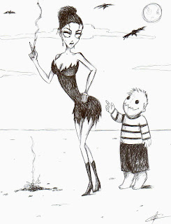
2nd Burton Style Artwork


Because of his original artwork, Burton is noticed for inspirational pieces in his renditions of them in his unforgettable motion pictures. Now fifty years into his life, he is still making exciting new concepts. All of these works are possible because they’ve started with simple dark ink and line artwork. This artist will always be recognized because of his option to be different in the world of art.